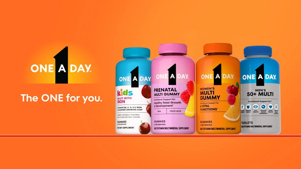
One A Day relaunched its entire portfolio under a new identity — "The ONE for you." I owned the key visuals: a modular system that carried 50+ SKUs across two formats and five consumer segments, from a Times Square billboard down to a mobile PDP tile, without ever breaking. Over a thousand assets. One system holding all of it.
One A Day needed a unified visual identity that could scale across 50+ SKUs, two product formats — gummy and tablet — and five distinct consumer segments, each with its own color story. Without losing the master brand.
The tension is structural. Women's, Men's, Kids, Prenatal, and 50+ each speak to a different person and carry a different palette. Design each one on its own and the shelf turns into five brands wearing the same logo. Force them all into one look and every segment loses the color equity shoppers actually navigate by.
Then multiply by channel. Every visual had to be channel-ready by construction: sharp enough for a billboard, flexible enough for an Amazon A+ module, a Walmart PDP tile, a paid-social crop, and a print page — without a redesign at each step.
I built the KV system around the new logo lockup and the "The ONE for you." tagline, and drew a hard line down the middle of the design: typography, lighting, and pack architecture never move; the brand field flexes by segment. Orange for the portfolio, blue for Men's, cyan for Kids — each segment gets its color story, and everything else is invariant.
That one rule is why the system scales. A new SKU isn't a new design problem — it's a slot in the matrix. And because the lighting and camera language were locked, the photoreal 3D renders for every pack could be produced consistently at volume, art-directed once and applied across the line.
To make the system survive beyond my own hands, I codified it into a digital brandbook and used it to direct agency partners — so work produced outside the building came back on-system, not just on-brief.
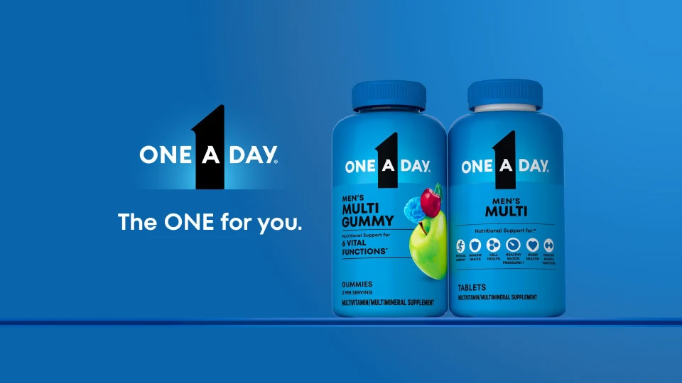
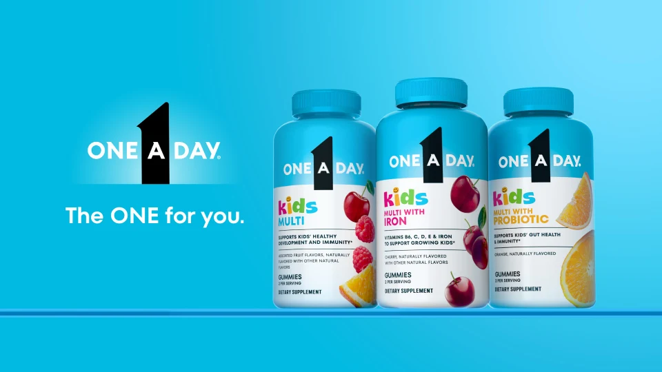
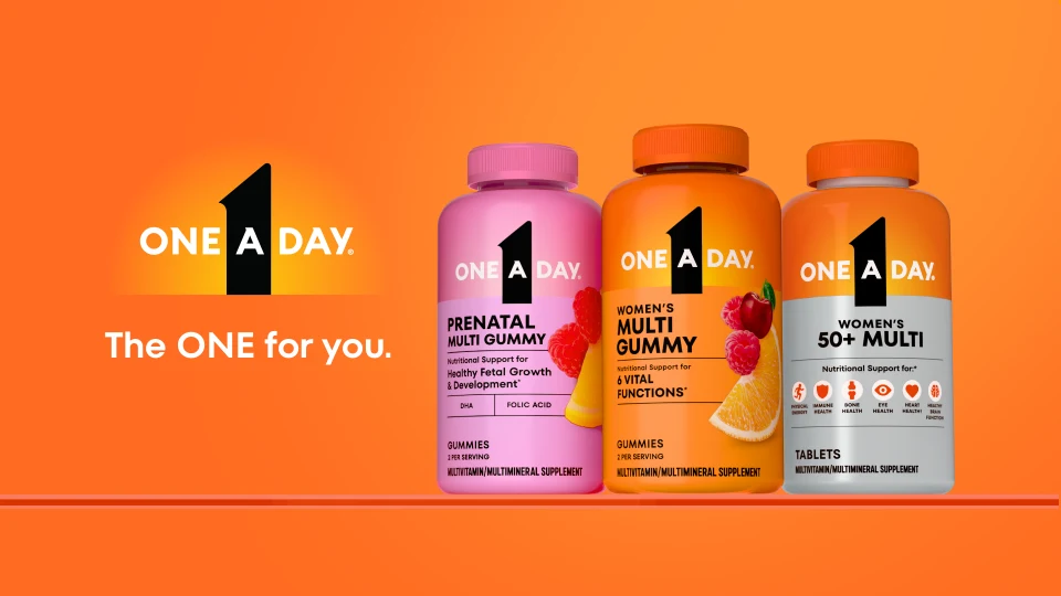
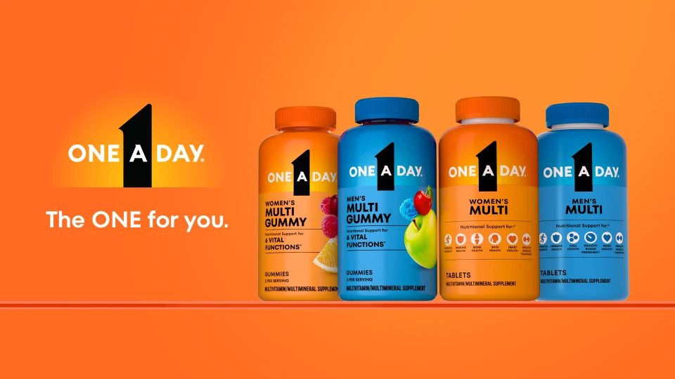
The relaunch lived on digital shelf and social before it lived anywhere else — so the identity had to hold up moving. The motion work uses the same brand fields, the same lighting, the same pack architecture as the stills: the KVs brought to life, not a separate campaign.
Under the campaign layer sits the unglamorous majority of the work: individual photoreal renders for every SKU — each pack fully legible, lit for both shelf and screen, consistent with every other pack in the line. This is where the locked lighting and camera language earned its keep; the volume was only possible because the craft decisions were made once, at the system level.
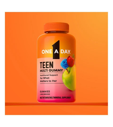
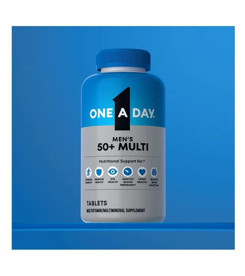
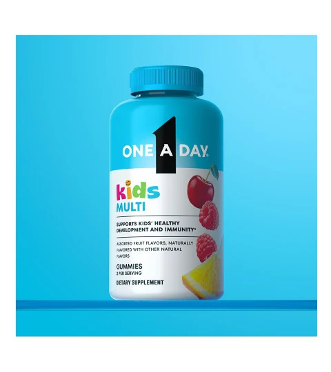
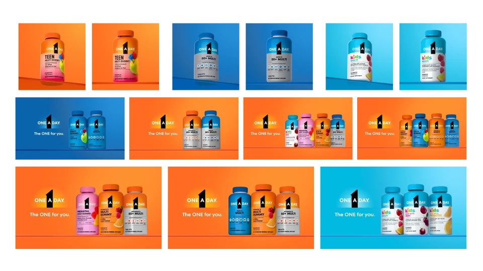
The relaunch shipped as a single coherent identity across Amazon, Walmart, Target, retail, brand .com, social, and print — simultaneously, on one system.
A system this stable becomes a platform for work the original brief never asked for.
I art-directed a full Kids photoshoot and video production — translating the cyan brand field and pack language into live action, so the photography sat beside the renders as one family rather than two campaigns.
Prototype explorations for AR pack experiences and gamified brand interactions — unshipped, but the kind of question a locked system frees you to ask: what does "The ONE for you." do when the pack is a portal instead of a shelf object?
This portfolio of segments, palettes, and pack architecture later became the training ground for CreativeLab — the node-based generative tool that turns exactly this kind of brand system into channel-ready imagery in minutes.
Fifty key visuals is output. A system where the fifty-first designs itself — that's the work.