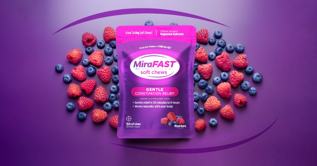
MiraLAX is Bayer's #1 laxative brand — and its growth had plateaued. I redesigned the logo to work at shelf, built a modular identity system around it, and that system carried two launches: MiraFIBER with a full development cycle, and MiraFAST from inception to design lock in three weeks. This is the story of designing for the second launch before the first one shipped.
MiraLAX owned its category, but it was a single-format brand. The growth strategy was line extension — new products for adjacent needs, launched on MiraLAX's shelf equity.
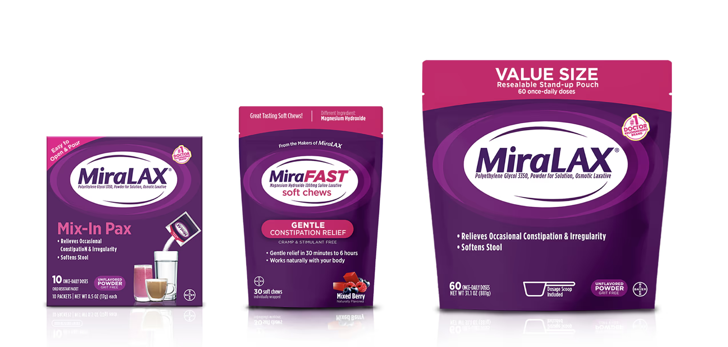
The design problem underneath that strategy was harder than it sounds. Each new product needed its own identity strong enough to stand alone at shelf — in ecommerce tiles, in advertising — while reading unmistakably as MiraLAX family. Too close, and the extension disappears next to the parent. Too far, and it throws away the equity it was built to borrow.
And there was a constraint I could see coming: this wasn't going to be one launch. If the platform worked, more formats would follow — and the second one would not get the timeline the first one got.
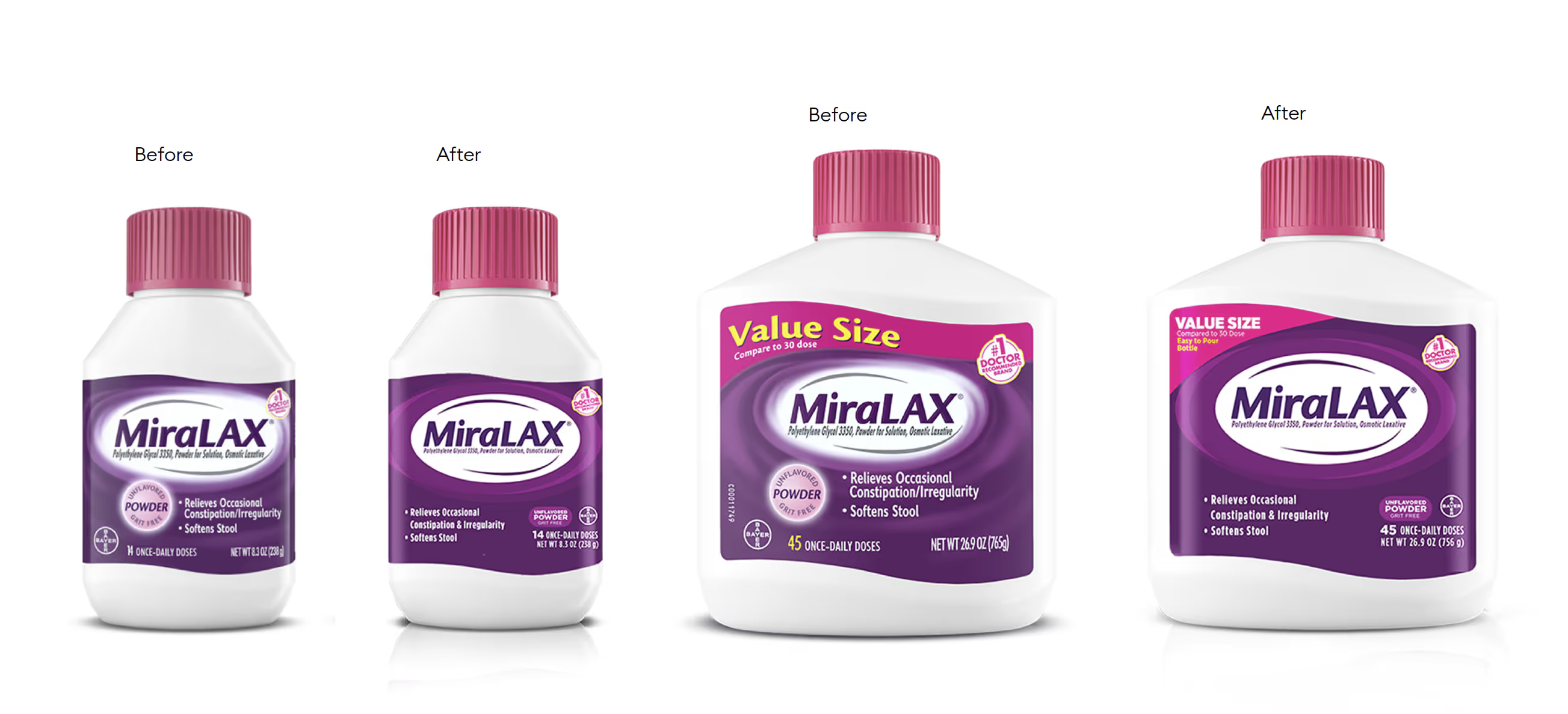
Before any extension could work, the base brand had to. I redesigned the MiraLAX wordmark itself — simplifying the letterforms so it reads at shelf distance and survives small scale: a mobile PDP thumbnail, a retailer app tile, the corner of a coupon. The old mark was fighting its own package; the new one anchors it.
That redesigned logo became the structural foundation for every sub-brand that followed — the fixed element that lets everything else flex.
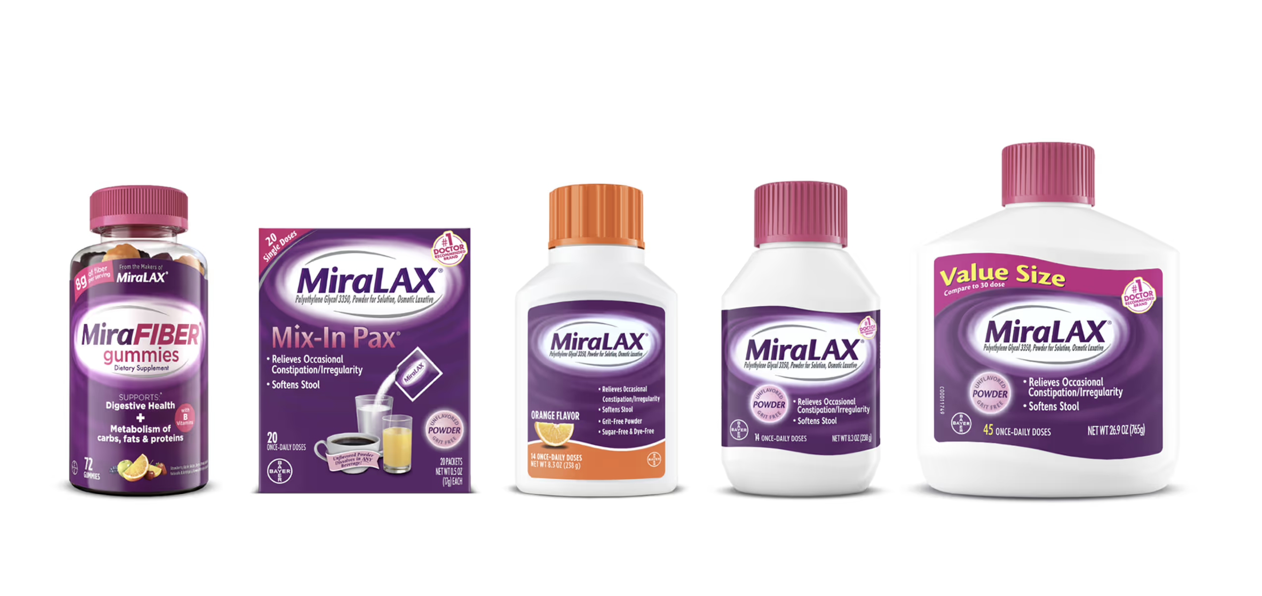
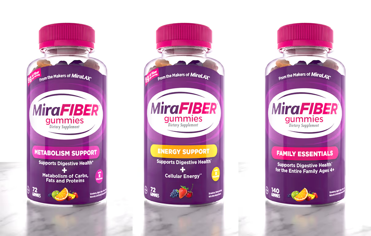
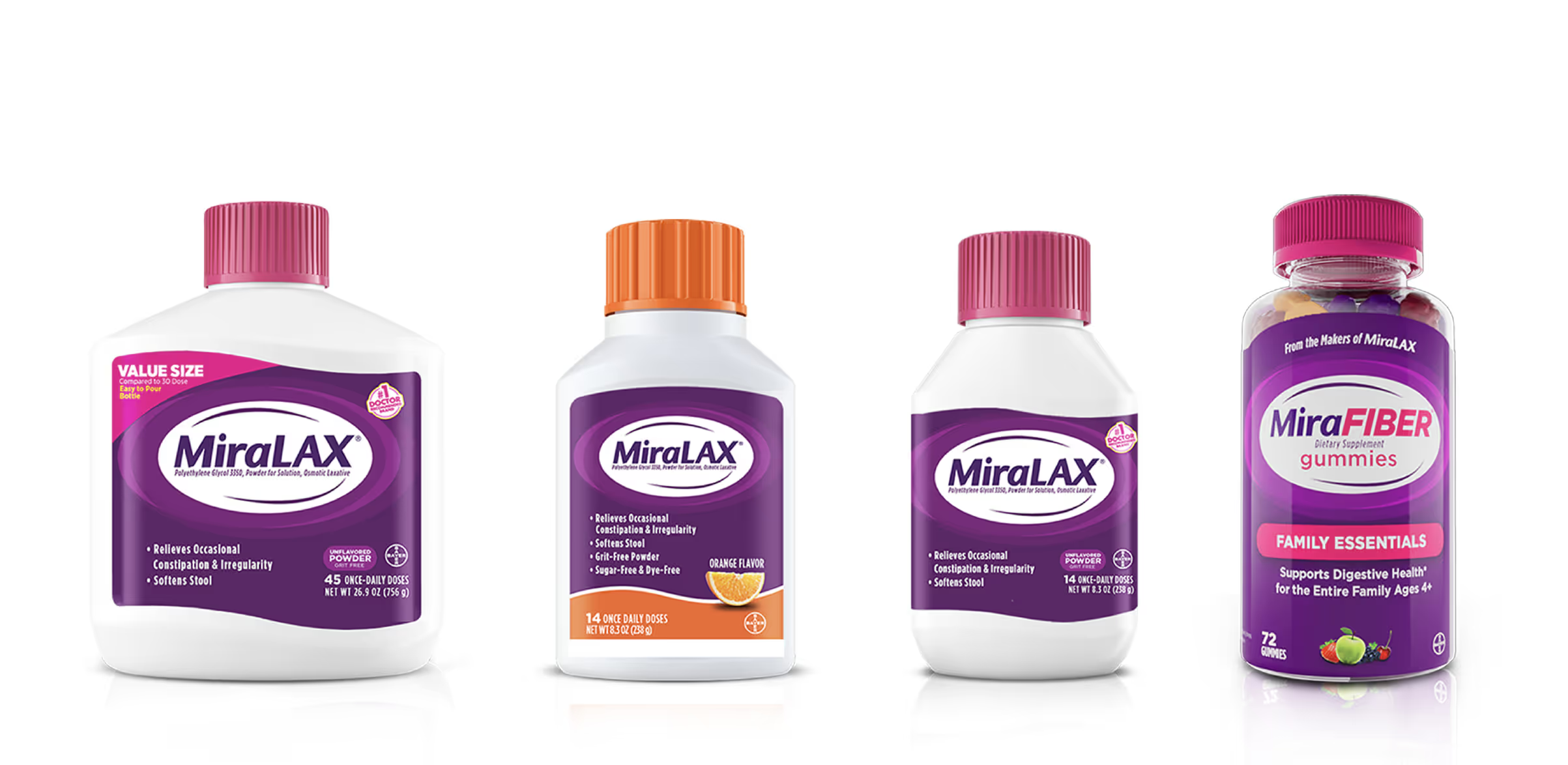
MiraFIBER (2023) got the full development cycle — and I spent it building more than one package. Colour palette, typography hierarchy, packaging architecture, and a set of brand-world visuals that flex across cartons, bottles, digital ads, and retail displays. Every element was deliberately built as a component that could be recombined — for new SKUs, sizes, formats, and, eventually, entirely new sub-brands.
The launch went from shelf to screen — packaging into ecommerce, web, motion, and visual merchandising, one system holding it together. Launch communications drove sales more than 50% over projection, and the line has kept growing since — outpacing its category.
When MiraFAST Overnight Chewables was greenlit in 2025, the timeline was three weeks to design lock. Not three weeks to a concept — three weeks to final, production-ready packaging.
This is the moment modular systems are for. I adapted the kit — a new colour story, distinct product treatment, its own graphic elements — while the structural framework carried over intact. The result was a second brand that reads related-but-differentiated, delivered on a timeline that would have been impossible starting from zero.
The market answered. MiraFAST launched at 5× the sales velocity of its predecessor SKU, passed the established MiraFIBER line within three months of full distribution, and became the #1 Laxative Soft Chew SKU and #1 Overnight Laxative SKU — the third fastest-growing Digestive Health launch in five years (Circana MULO+, through 5/17/26).
The two SKU lines I designed have generated roughly $79MM+ in combined retail sales — and turned MiraLAX from a one-format brand into a digestive-health platform on one cohesive system.
Honest attribution: those numbers belong to a whole cross-functional launch team — marketing, insights, sales, supply. What I own is the design: the rebuilt wordmark, the packaging, the modular system, and the shelf-to-screen creative for both launches. The claim I'll stand behind is narrower and more interesting — the system is why the second launch could happen in three weeks without looking like it did.
The platform keeps extending: I've since designed the MiraGut and MiraProbiotic line extensions and the MiraLAX 50-dose bonus pack — each a recombination of the same kit.
Beyond the shipped work, I developed brand-world concepts extending the MiraFAST and MiraFIBER identities into advertising, digital, and retail environments — the visual territory the platform grows into as new formats join it.
A launch is one deliverable. A system that makes the next launch take three weeks — that's the design.