BOLD was Bayer Consumer Health's internal brand-building tour. I led its design system across three consecutive years — identity, 3D, motion, a live stage, and the objects in your hand — refreshing the theme each year while one system held it all together. This is the part a gallery can't show: how you keep a single idea coherent across three years, four formats, and a room full of your own marketers.
The audience was the hardest possible one: the people who make brands for a living. Bayer Consumer Health's own marketing organization, plus partners from Google, TikTok, Pinterest, and BBDO.
An internal summit usually looks like an internal summit — a logo, a template, a deck. The brief here was the opposite: make the company's annual brand-building event feel like a real brand, the kind these people would respect because they build them for a living. And it couldn't be a one-off. It had to run three years, survive a shift from virtual to hybrid to in-person, and feel new enough each year that no one thought they'd seen it before.
So the real design question wasn't “what does this year's event look like.” It was: what stays fixed, and what gets to change, so the tour reads as one thing over three years instead of three unrelated events.
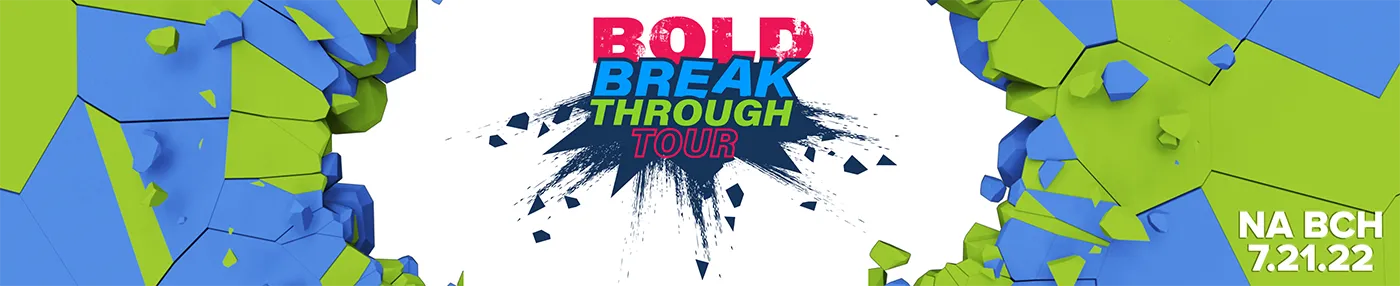
I built BOLD as a system with a constant core and a changing surface. The DNA stayed fixed every year: the BOLD wordmark with its power-button “O,” a tech-forward visual language, and Bayer's blue-green-magenta energy. The theme changed annually — each year got its own metaphor, motion, and mood:
Ambition (year one) — “Be bold. Be brave. Be ambitious.” Activation (year two) — power on, the circuit lights up. Breakthrough (year three) — smash through the wall. Same brand, three chapters.
Because it was a kit and not a layout, years two and three were reinterpretations, not rebuilds. The wordmark, the color logic, the motion grammar, the section system all carried forward — which is exactly why three separate events still read as one tour.
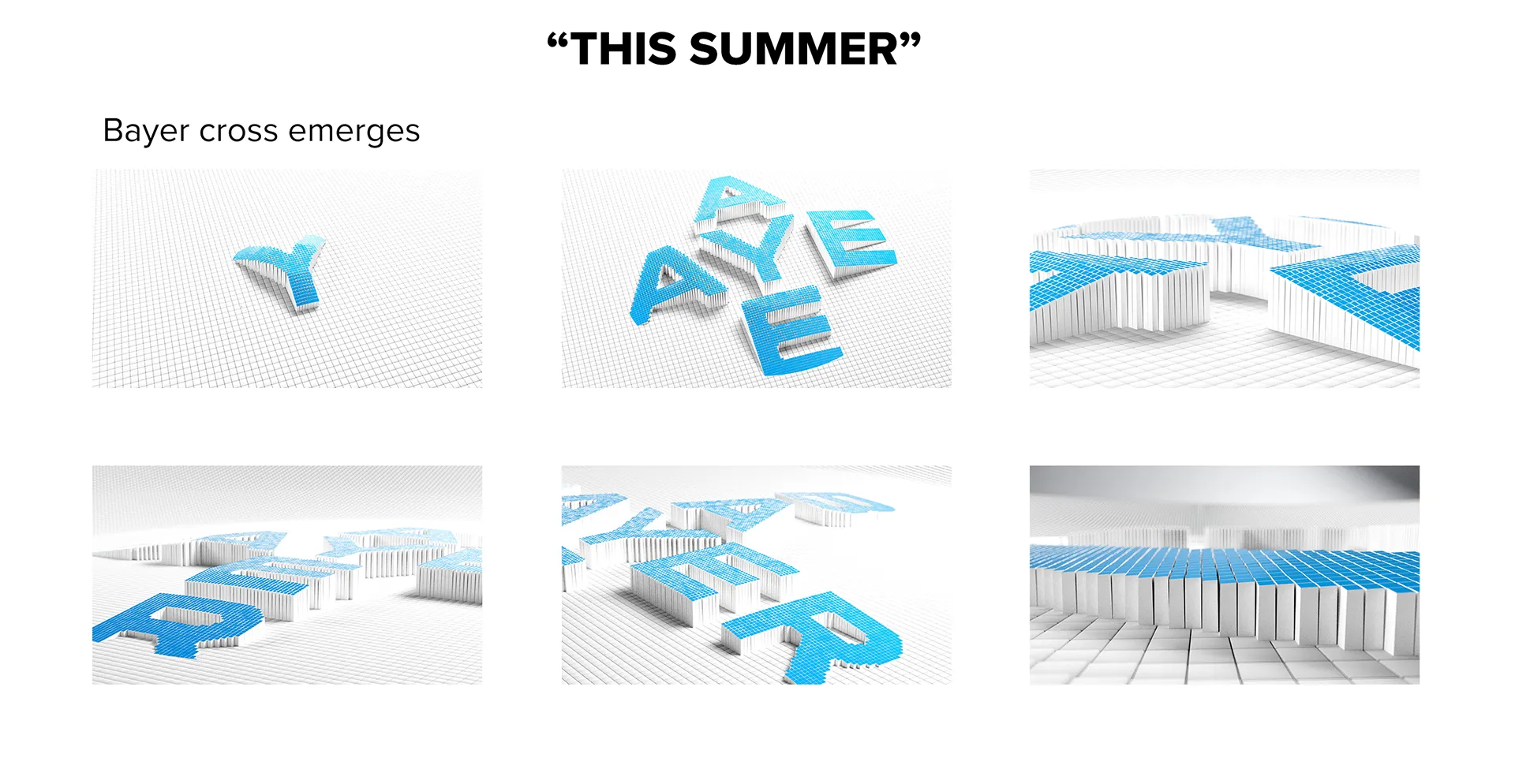
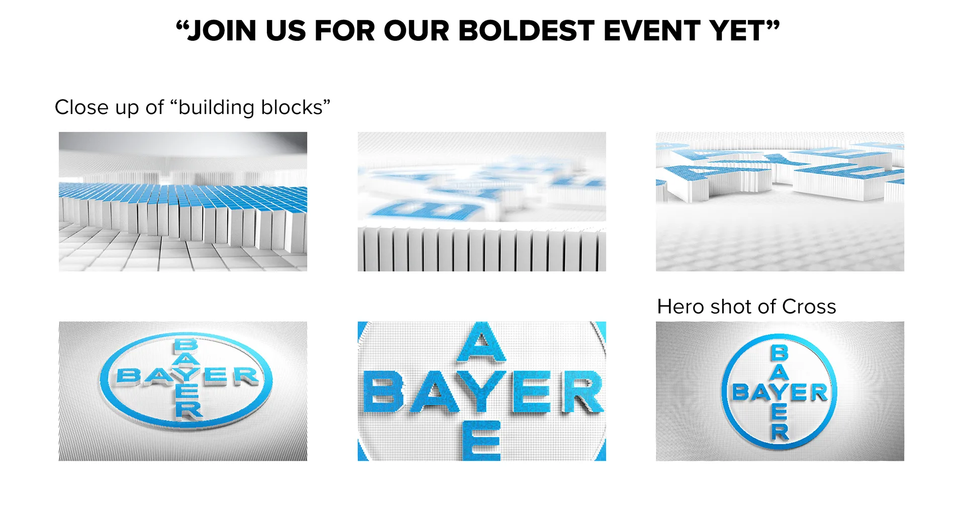
Half of how an idea lands in a room is motion. I storyboarded the stage opener in Cinema 4D — the Bayer cross assembling itself from a field of building blocks, resolving into the logo — then built it out into the film that opened the event. Thinking in form and movement, not just static frames, is what made the identity feel alive on a screen the size of a wall.
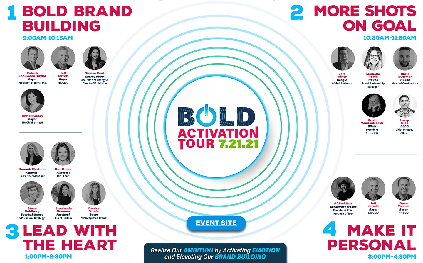
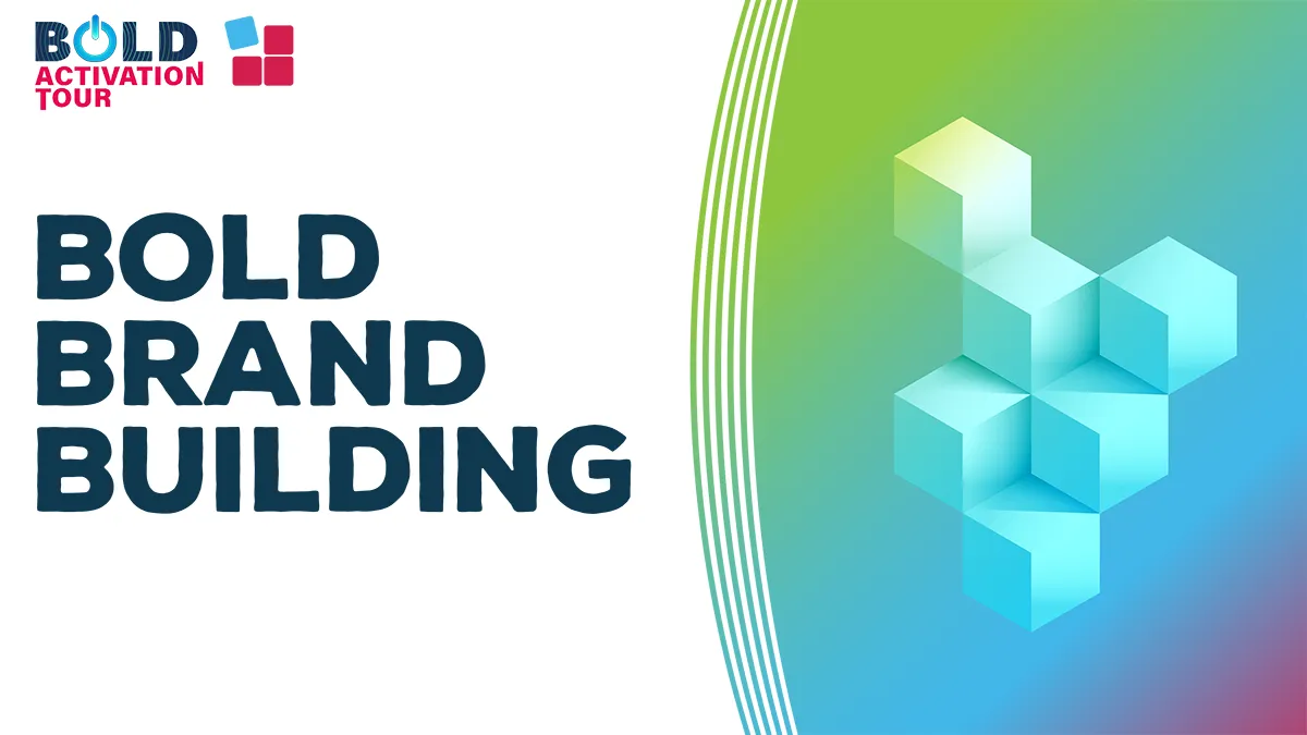
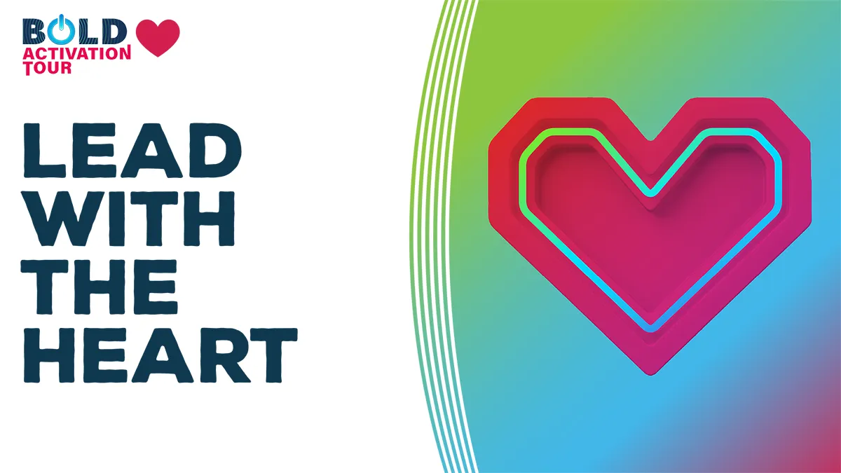
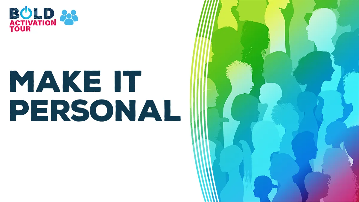
A live event lives or dies on the details most people treat as admin. I designed the agenda itself as a piece of the brand — four themed acts (Bold Brand Building, More Shots on Goal, Lead with the Heart, Make It Personal), each with its own section graphic in the system. Every slide a speaker stood in front of belonged to the same world as the invite and the stage film. Over three years the format moved from virtual to hybrid to in-person, and the system carried it the whole way for a 200+ audience.
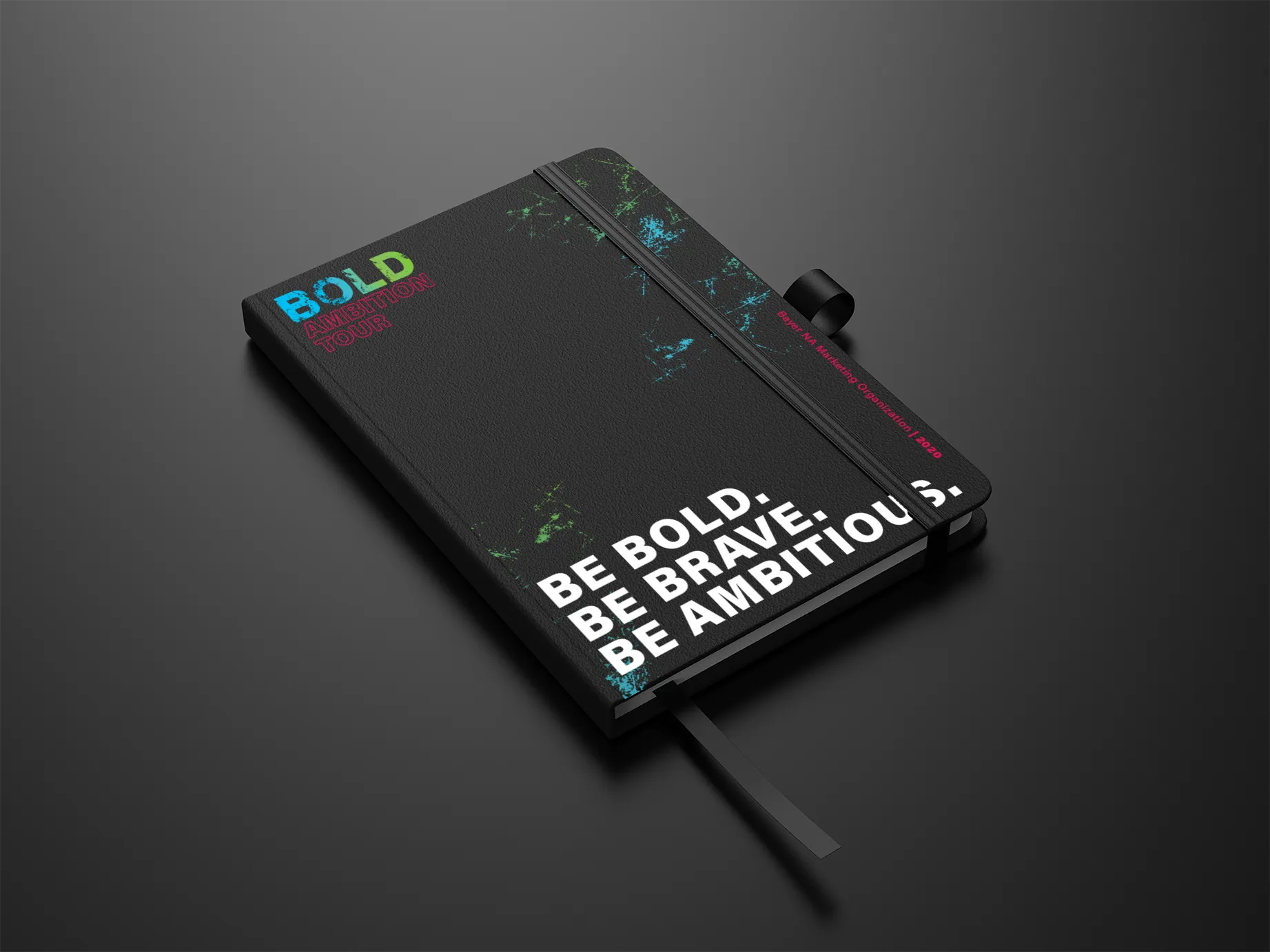
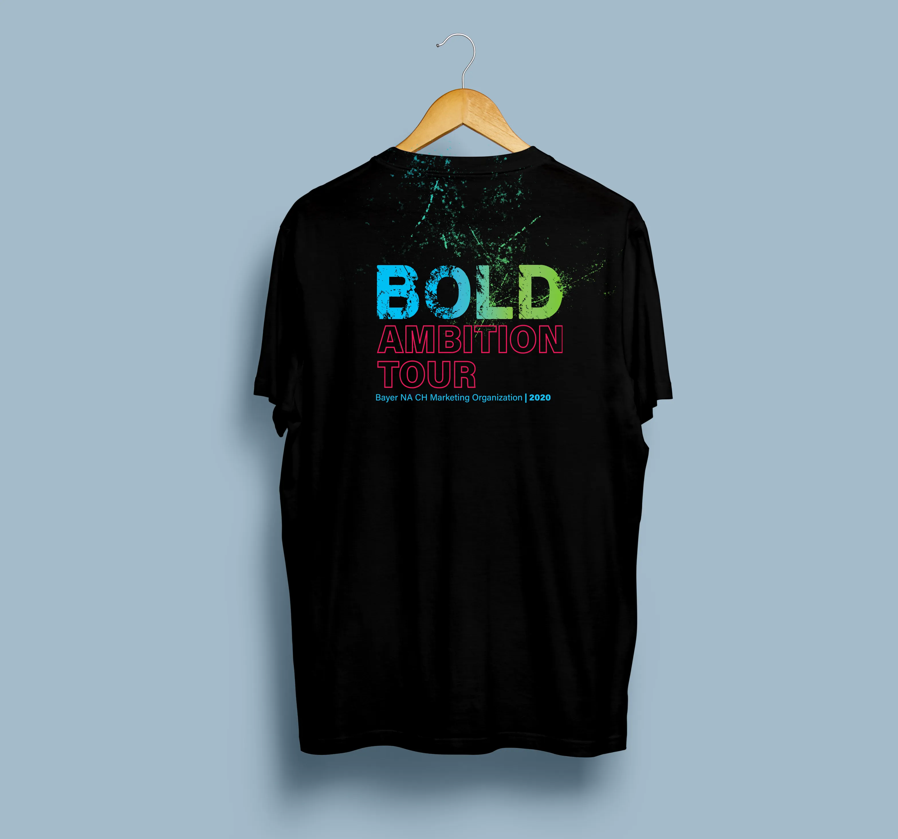
The last surface is the one people keep. I carried the system onto the objects attendees took with them — a notebook that says “Be bold. Be brave. Be ambitious,” apparel with the year's mark. An integrated idea isn't done when the screen goes dark; it's done when it's sitting on someone's desk a year later.
Three years, every medium, one recognizable idea. That continuity was the deliverable — more than any single asset.
What I'd carry forward: the “fixed DNA, evolving theme” model is the reason this scaled without fatigue, and it's how I'd approach any multi-year brand platform. If I did it again, I'd formalize the kit even earlier — a documented motion and section grammar from day one — so partners and vendors could extend the system without me in the room. The point was never the individual poster or film. It was building something coherent enough to run.
One idea, taken across every medium it needed — and built to last three years, not one night.